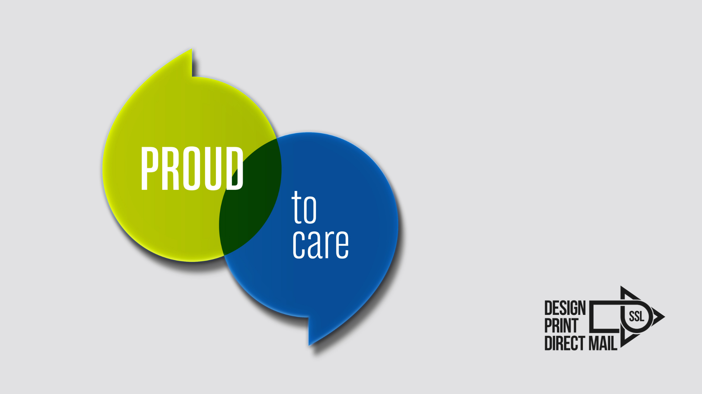
As you can see, we have created a stunningly strong brand identity for Barnsley Hospital and it perfectly reflected the core values they were looking for.
Nurses and colleagues at the hospital were initially asked how they felt working for the hospital, the word that kept consistently coming up was ‘proud.’ Based on this idea our team of creatives developed the fully cohesive brand. We also came up with various straplines that were transferrable across every area of the hospital supporting the Proud brand. The graphics had to be both patient and staff friendly and clear and concise in their message.
It was important to also introduce bursts of colour with the brand indent helping create a pleasant environment uplifting staff’s spirit making the patients and visitors journey more relaxed and satisfying hoping it would promote a more enjoyable experience.
We ensured every piece of marketing and internal collateral was carefully considered. From the pens and lanyards, to staff handbooks, stationery, departmental leaflets, posters, signage and lift wraps the full shebang!
Here you can see, just a few of the designs, there are more to see in the gallery.
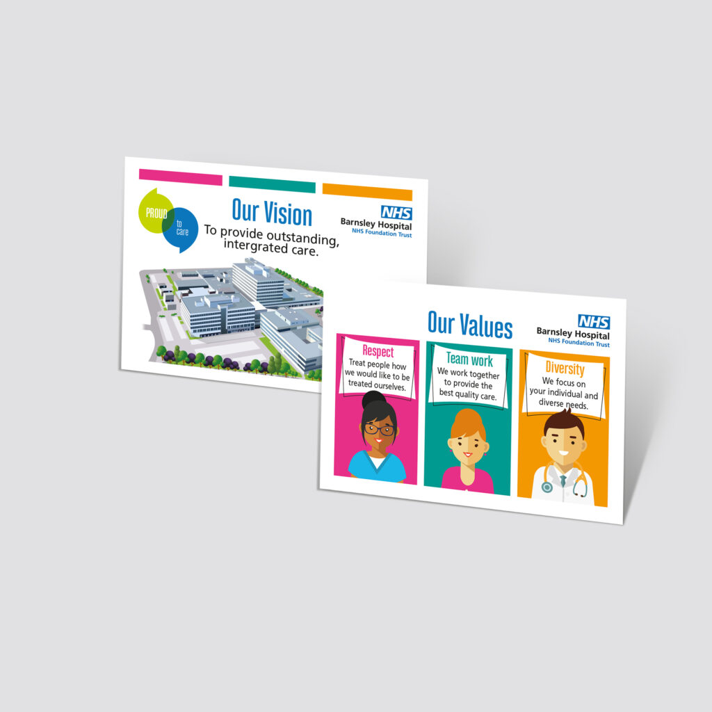
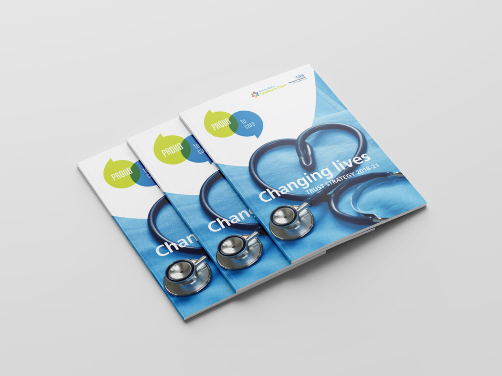
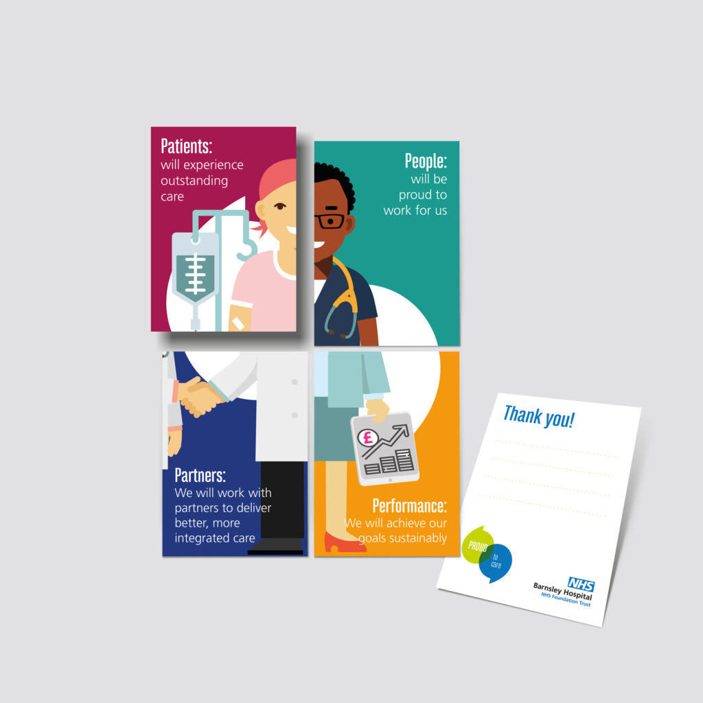
As you can see from these and the other images on the gallery, we really got under the Barnsley Hospital’s skin and quickly understood their requirements and delivered not only one piece but a variety.
If you would like to talk to us about a design idea you have, whether it’s for a new business, product or service offering or simply a brand refresh, we’d love to hear from you.
Just drop us a line here: hello@ssldirectmail.co.uk or call 01226 249035
